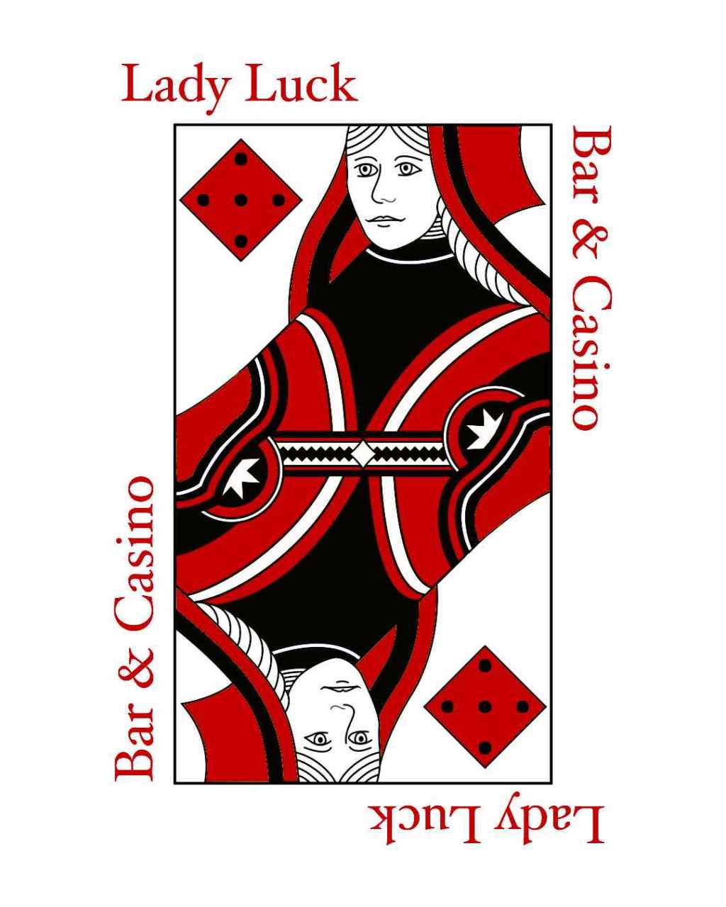
This past autumn, I have taken a Desktop Publishing class at Lamar University. The following is one of my assignments for that class and my thought process behind it.
Combining graphic and text
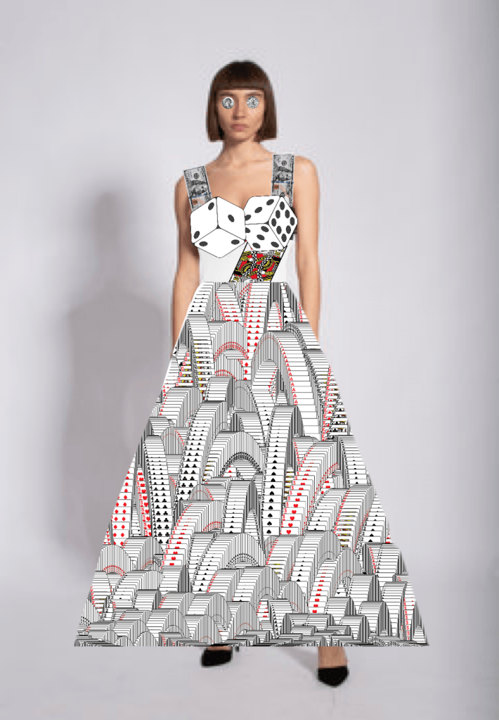
Our first assignment was combining two words to create a novel graphic to base a design off of. I decided to use the preexisting phrase “lady luck” for my design, because I had already been thinking of wanting to make advertisements for a casino. Admittedly, I misunderstood this assignment because I didn’t know it was meant to be a logo, or I would have designed it to be much simpler. Regardless, my original concept was the image of a woman combined with cards and money. While reviewing our designs, my class informed me that it was too complicated, and my professor helpfully reminded me that there is already a female figure associated with casinos: the queen card. This was the direction I went for simplifying and designing my logo.
Designing a logo
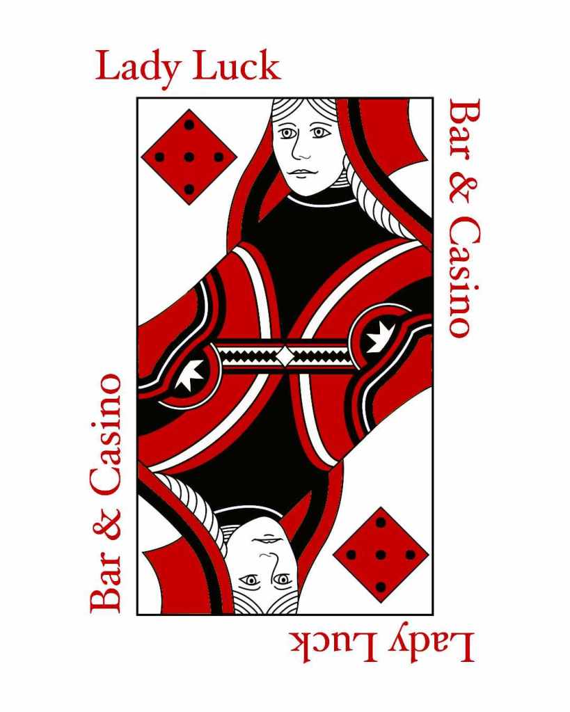
For my logo, I had to design something that would be recognizable from afar. My main inspirations were the Starbucks logo and, as I mentioned, the queen card. Ultimately, I decided to go with simple and use the Queen of Diamonds, since the diamond suit is associated with money. However, most cards I could find had very complicated designs, so I simplified mine to a three-color scheme. The red and black does not just parallel card suits, but also the two colors of a roulette wheel, reinforcing the casino aesthetic. I also changed the diamonds in the corners to dice to emphasize the gambling aesthetic. The title “Lady Luck Bar & Casino” around the Queen is to parallel the numbers on a playing card. I intended for the inside of the rectangle on this design to be white and the outside to be transparent, so the red “Lady Luck Bar & Casino” can rest on whatever color the background may be.
Both of these designs were made by editing photos in Autodesk Sketchbook. I feel that the second logo is more effective because it is simpler, more easily recognizable, and frankly, more personable. The second Lady Luck is smiling and seems like a friendlier mascot than the first, and is more likely to convince people to come to the bar and casino I am advertising.


Leave a Reply