For our third assignment, we were assigned to create two advertisements: one with words and a graphic, and one only with words.
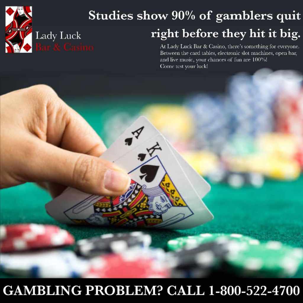
For my picture ad, I used Lady Luck Bar & Casino because I wanted to build on my casino idea. Typically, casinos have very maximalist, overwhelming advertisements to mimic the feeling of being in a casino. I wanted mine to have a more high-class, witty feel to it, which is why I used Baskerville as a font. I realize now the program I was using isn’t very kind to smaller text and tends to make them more pixelated and hard to read, so I will definitely correct that next time. The caption isn’t based on a real study, but is based on a popular meme circulated in gambling communities online. I wanted to encourage people to stay in the casino longer to increase their chance of “hitting it big.” In the smaller text, I go into detail about the other features the casino offers. The picture is a royalty-free stock photo I found online showing a perfect hand in Blackjack, to demonstrate to the viewer how easy it could be to win. Also, the gambling hotline banner at the bottom was not originally part of my design, but I noticed many casinos in this area include it, either as part of an advertising policy they follow or because they don’t want to seem like they’re enabling addiction. It’s similar to how alcohol ads will include a “drink responsibly” disclaimer or even a hotline for alcohol addiction support. It seemed counterproductive to me at first to include this, since it contradicts the gambling I’m advertising, but I decided it would be the responsible thing to do.
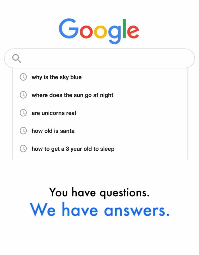
For my text ad, I decided to use Google. I wanted to indirectly tell a story through the ad, and remembered how my parents would turn to Google during my nonstop question phase as a little kid. I decided to draw from that, using the audience’s sense of humor and sentimentality to sell the service of Google Search. It’s very minimalist as Google ads usually are, and just shows a simple Google search bar with the search history showing. It includes questions a small child might ask, and then a search about how to get a 3 year old to sleep, indicating the exasperated parent trying to calm the child down. This way, there’s a familiar experience parents can relate to in the story behind this ad, and the audience forms a positive connotation to Google. I drove this home with the caption “You have questions. We have answers.” in Futura, to show the simplicity of the message behind Google’s conception. The “We have answers” is bigger and blue to draw the eyes more towards the service Google provides rather than the problem the audience has. If I were to continue this ad, I could see it becoming a bigger campaign, where each “You have questions. We have answers.” ad has a different story told through the search history.
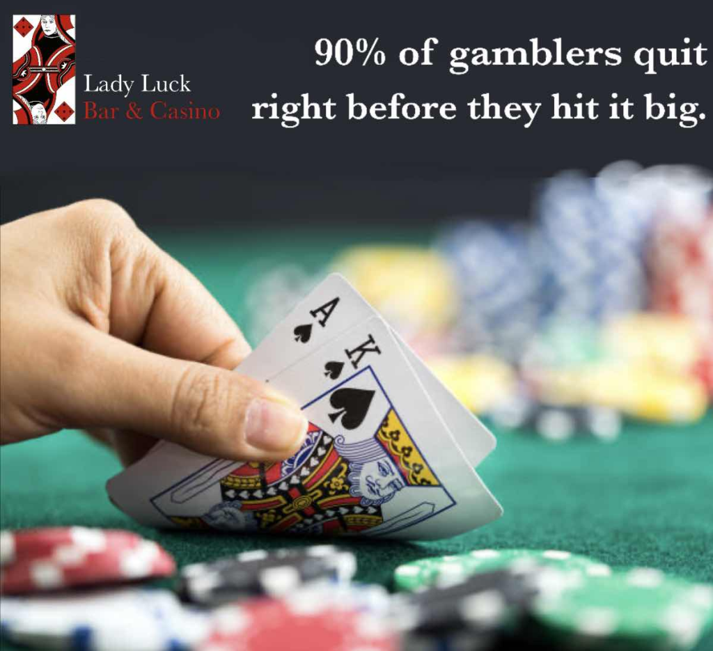
In class, the advice I received help me understand the assignment a lot more. I imagined the Lady Luck advertisement being a page in a magazine where smaller text could be read more easily, but I was informed that this just made the advertisement feel more crowded. On top of that, the gambling addiction hotline seemed counterproductive, so I figure it could be either smaller or added in post-production and not as a part of the original advertisement. Below is my improved Lady Luck advertisement.
The Google advertisement was more well-received, since most of the class understood that it was meant to be an exhausted parent dealing with a small child and thought it was cute. While my professor suggested I should put a question in the search bar, I felt it would break up the flow of the story being told in the search history. Therefore, with this being the only advice given on how to improve, I kept the Google ad the same.
Both ads were created by editing photos and text with Autodesk Sketchbook.


Leave a Reply